Atlético de Madrid is one of the great clubs of European football. Its evolution as an entity and successive sporting successes have made it one of the most recognized and admired teams globally. Vasava receives the commission to update his visual identity to face the current challenges without renouncing the essence of the club.


114 Years of History. A legendary team gets revitalized.
After several decades without updating the visual identity of the club and with the aim of tackling present and future challenges, Atlético de Madrid club decides to evolve its visual codes by updating them with the goal of making its values and history converge with the new objectives and progress plans.
This plan includes the updating of branding elements, the creation of a complete brand manual and the creation of an integrated communication concept that delivers the new brand positioning and reaches new fans.
The wordmark has been redesigned in a contemporary sans serif typeface adjusting its weight and the size relationship with the crest, ensuring consistency across the different lockups, alone, horizontal, vertical and with the foundation year.
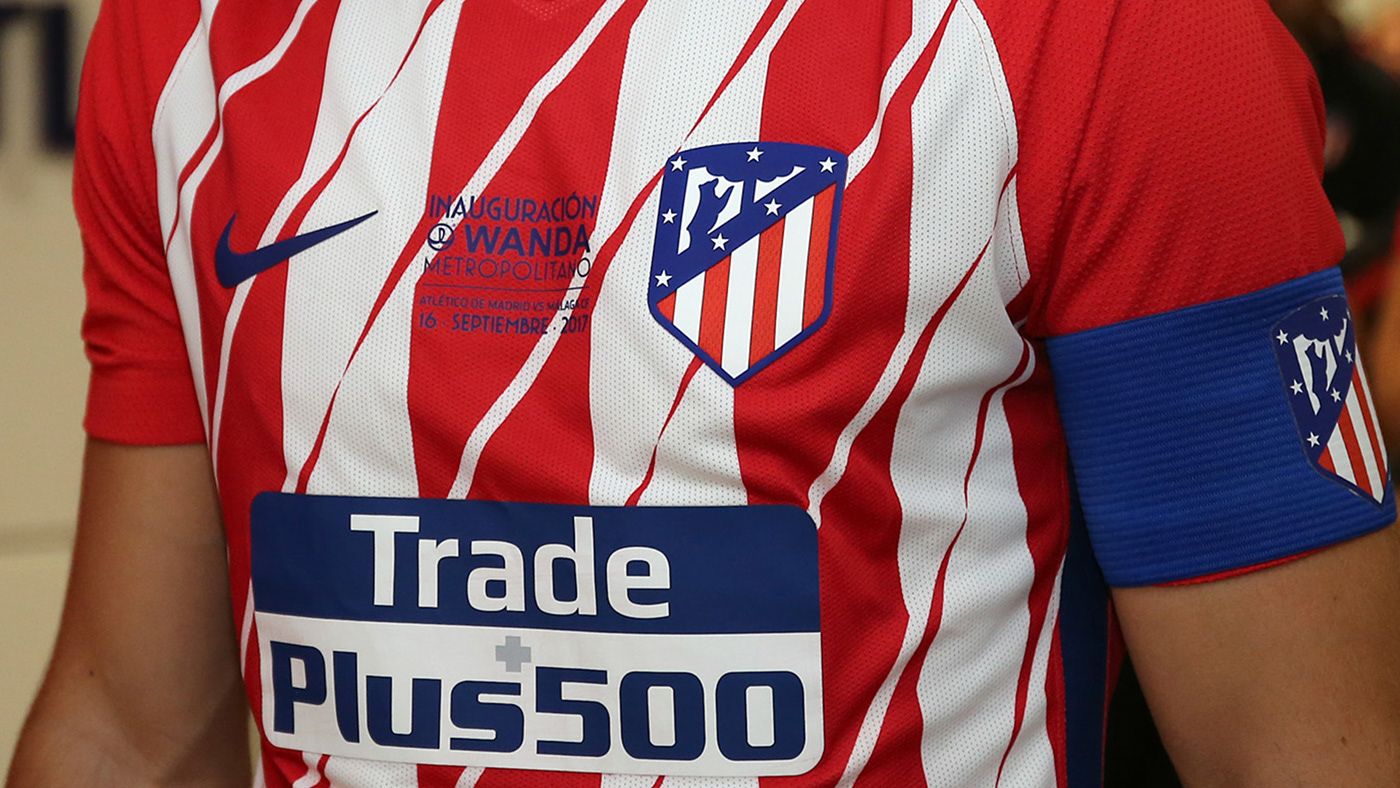
The colors have been reduced to the fundamental tri-colored code of Atlético de Madrid. Disappear black, brown, green and yellow, to give prominence to the core team colors, red, white and blue modifying its intensity and tone being used now as the first historical stage of the club. Rules of use have been established to ensure the right proportion of each hue on every single layout.
One new visual code has been introduced –the dynamic lines, it is a strong texture of lines representing the strength, dynamism, and fluidity of the team’s gameplay as well it connects with the classic striped pattern of the team’s shirt.


ATM Metropolitana is the typeface designed for the jerseys. It is used on all European competitions, and occasionally –with care and craft– in some of the products or communication of the team. The inspiration draws on the Art Decó typefaces that you could find on the tickets and signage on the old stadium Metropolitano during the 30s.
The sharp inverted triangles of the A and the geometrical feeling of the letterforms was used as starting point to design a new modern typeface –optimised for shirts legibility and display purposes– that is bold and strong but it has an eye in history.
The sharp inverted triangles of the A and the geometrical feeling of the letterforms was used as starting point to design a new modern typeface –optimised for shirts legibility and display purposes– that is bold and strong but it has an eye in history.


Indi is the atlético de Madrid Mascot since decades ago. It was created in the form of a raccoon, dressed with an apache costume due to the popular nickname of “indios” for the Atlético supporters. The character didn’t have specific guidelines of use and it was poorly developed by the licensees. Vasava redefined the mascot’s aspect and a stylebook. As part of the character development and commercial exploitation, a baby versión of the Indi was introduced, aimed at the baby products merchandising.
Motion design guidelines and templates were made to serve as the foundation for the visual development on screens and scoreboards of the new stadium Wanda Metropolitano. The strength, sharpness and flat color approach of the identity was infused into every screen of the stadium.
The digital narration of the brand was executed as well on social media channels, as an extension of the brand’s storytelling. The assets were executed to create a digital narration of the matches.


“El triunfo de un sentimiento”
The triumph of a sentiment
This season the club has grown and has become a global entity, has members in all the Spanish provinces and in 74 countries of the world, has moved to a brand new stadium. It is positioned in the third place in the UEFA ranking and has won its third Europa League title.
19% increase in the number of club’s members over last season. (122.190 in total)
29% Merchandise sales growth over last season.
404.127 Sales of product units that show the current shield. (3/31/2018)